Bad Spellers Are Secret Geniuses.
We’ve all seen them: the misspelled sign.
Sometimes it’s professionally produced, which means several people had a chance to catch it and somehow nobody did. Other times, it was quickly typed up in Microsoft Word and the spell checker apparently took the afternoon off.
It doesn’t happen as often anymore. Technology has made a difference. But it still happens, and sometimes...it’s brilliant.
I once worked at a large retail store with a personnel office inside it. Above the window, painted permanently in cursive, was the word PERSSONNEL.
It always made me smile.
There was nothing brilliant about it. Somebody climbed a ladder and painted it above the window. And no one did anything about it.
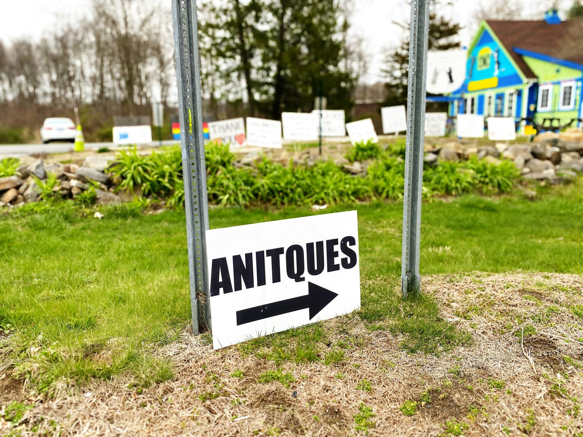
Misspelled signs are hard to ignore. You almost can’t not notice them. I’m sure that’s bad English, but hey, isn’t that the point of this article?
Actually, no.
This isn’t about deliberately misspelling words to grab attention. It’s about the brilliance of people who break patterns—sometimes deliberately and sometimes without knowing they’ve done it.
Most things look the way we expect them to look. Stores look like stores, websites look like websites, and corporate reports look like corporate reports. Once our brains recognize the pattern, we stop paying much attention.
Then there are the Berkshire Hathaways of the world—the ones that break the pattern on purpose.
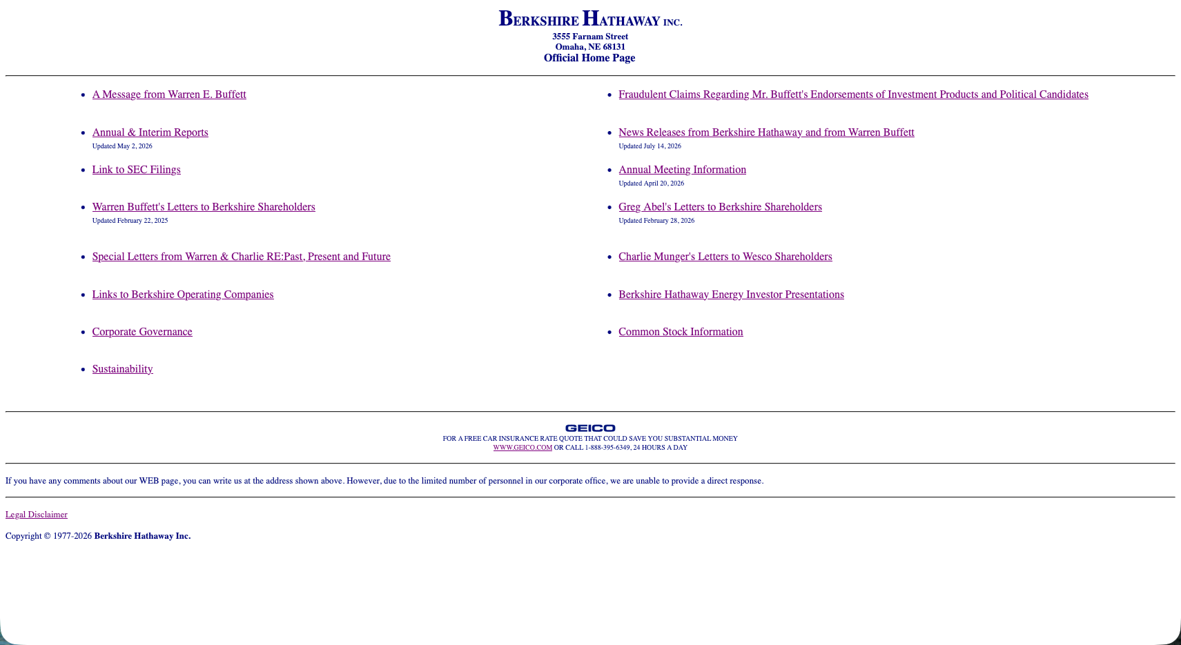
Berkshire Hathaway is one of the biggest and wealthiest companies on the planet, and its website still largely looks like it did in the 1990s. Look at the screenshot.
The company owns a railroad, insurance companies, utilities and more businesses than most people could name. And it's sitting on something like $367 billion...in cash.
No videos. No fancy graphics. No grand speech about changing the world. It looks old and it refuses to blend in. That's why it works.
Berkshire does this on purpose. The person who added an extra S to personnel probably didn’t. But both broke the pattern.
You see it elsewhere too: the local commercial where the owner reads his own lines badly, the restaurant with the big chicken out front, or the store with a name that should never have made it past the first conversation.
A consultant might tell them to clean things up. Replace the chicken. Modernize the sign. Hire a professional voice for the commercial.
The consultant would probably make everything look better. They might also make it invisible.
Nobody tells their family to turn left at the tasteful new sign. They turn left at the giant chicken.
That doesn’t mean every mistake is secretly brilliant. Sometimes a misspelled sign is just a misspelled sign, and bad design can still be bad.
But people spend a lot of time trying to look professional, current and correct. They smooth out every odd edge, fix every unusual phrase and update everything until it looks like everything else.
Then someone adds an extra S to personnel.
And thirty years later, you still remember it.